Type[faces]
As a designer for print, I have always given special attention to typography—the style and appearance of printed matters. At one look, the type gives the impression if the artist has certain sophistication in his or her taste as a designer. A good designer has the special eye for the font styles he or she uses in a particular project. The designer too has the control over the number of styles the project requires. This has something to do with designers who would seem to squeeze all the font styles on a single page so that thereafter the page would look like a circus of types.


My department chair had already informed me that I will be handling the special course on Desktop Publishing for the first semester. I am pretty excited for this. First part of the course shall be devoted to Typography—something that has not been studied thoroughly here in Bicol, except by students of fine arts and designs. Perhaps, if our trapoliticians are able to bamboozle us now with posters with shitty typography and celebrity-like masquerading, this can be my simple way of educating people that even these useless signage are of low quality and taste; and that even with these ‘banners of hope,’ they are deceiving us.
For one who wishes to devote oneself to the art of designing for print, typography is an exciting and yet not so easy consideration. For example, I still believe that even if we have been using Times New Roman as the default font style for Microsoft Word for many decades (even until now that it has been replaced with awful Calibri that looks like a try-hard clone of Adobe’s Myriad Pro), or perhaps caused by this very situation itself, Times New Roman remains a much underestimated font style. A few years ago, Ateneo de Naga University’s student paper The Pillars had displayed a masterful use of this type originally founded in 1931 by Stanley Morsel and Victor Lardent for The Times.
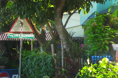
But there is no more fulfilling way of discussing typography than employing the examples of our trapoliticians’s campaign materials. Because even if Congressman Luis R. Villafuerte had managed to come up with a quite legible display of his name on those green panels of tin attached to almost every road sign in CamSur’s 2nd district, I would still suggest he stick to the official international road sign font, Helvetica Bold, for the veritable reason of consistency.
On the other hand, his son Lray, has a poorer taste for type styles by using oversized Impact for his graduation greetings. My views on his choices of colors, light orange and blue, are saved for next time. Worse, the critical viewer will surely recognize that Lray kind of jumbled his greeting message because of poor typography. He used an awkwardly expanded Rage Italic, for ‘Happy Graduation!’; then an extremely large Impact for ‘Graduates of 2009’, and a out of place-looking Goudy for the claim: ‘from Gov. Lray Villafuerte’.
Congressman Dato Arroyo, the distinguished-presidential-son-who-was-sent-to-save-Bicol, however, does not have the discerning eye for what could be read from a distance. Dato’s small blue panels, though, attached to warning signs along the roads of the first district of Cam Sur, are of better quality in make and material than those of Congressman Villafuerte. In typography, however, it looks like a post-modern variation of the Snellen scale. One can test his or her visual acuity by staring at one of these panels from a seven-foot distance. Aside from using a very small size of Lucida Calligraphy that barely looked like a yellow streak from a 5-meter distance, Dato’s name was compressed into a narrower Steelfish- or Impact-like type—something that could be used in determining the level of astigmatism because what mattered was not the thickness of the text but the hair-thin distances between letters.
What a waste of public money. What a disgrace to the different foundries that shaped these types into the wonders that they are. For each of these types has an exciting story of its own—from the moment of conception on the flat white paper to the casting of the type on to the metal. Search for the life story of Eric Gill who created Gill Sans, and you’ll know what I mean.
My department chair had already informed me that I will be handling the special course on Desktop Publishing for the first semester. I am pretty excited for this. First part of the course shall be devoted to Typography—something that has not been studied thoroughly here in Bicol, except by students of fine arts and designs. Perhaps, if our trapoliticians are able to bamboozle us now with posters with shitty typography and celebrity-like masquerading, this can be my simple way of educating people that even these useless signage are of low quality and taste; and that even with these ‘banners of hope,’ they are deceiving us.
This time, we may judge the book by its cover.

Comments
You are right. CamSur definitely needs a GRAPHICS DESIGN consultant to improve its Aesthetics now that it's going high profile. Do they have the budget , or all of it is Pro Bono ? Not only TYPOGRAPHY, but Layout, Design, Color, Space, etc. to make visual communication more effective and compelling.
You can't go wrong with Helvetica, specially for posters and signage. My favorite typographer was Herb Lubalin, who designed the typeface Avant Garde.
Camerlengo